Introduction
Today, many towns have logos that have not been updated since the late 20th and early 21st centuries. While these logos may carry a certain historical charm, this causes many logos we see to feel outdated in the present day. The purpose of this project was to develop a modernized identity for Connecticut’s (CT) state capital, Hartford.
Project Goals
To modernize the city’s visual identity, this project focused on creating cohesive, contemporary designs that reflects both community pride and visitor appeal.
- Modern Logo: Refresh the city’s logo with a more welcoming, versatile design that resonates with residents while appealing to tourists
- Minimalist Posters: Develop a clean, cohesive poster series promoting upcoming events, extending the modern aesthetic into the city’s public spaces
- Informational Brochure: Apply the new visual identity to an engaging brochure highlighting local landmarks, dining, and attractions.
Together, these elements aim to reintroduce the city through a unified brand experience that feels current, consistent, and authentically local.
Existing Logo Design (1852)
Hartford’s city seal features a stag (“hart”) standing in a stream (“ford”), a nod to its name and its location on the CT riverside. A grapevine represents CT, while an American eagle crowns the top, symbolizing national pride. The oak leaves framing the shield, symbolize freedom, and the motto Post Nubila Phoebus means “After the Clouds, the Sun,” reflecting the optimism of the city’s founders.
Logo Refresh
While Hartford’s current logo has layers of symbolism, it carries a more old-fashioned and serious vibe. We wanted to modernize the logo to give off a friendlier personality that is more inviting to tourists.
The new logo form is friendlier and more modern. The lines breaking out of the outer circle give a feeling of motion and progression. which ties into its color palette that pulls from the transit line CTfastrak. This green gives a sense of familiarity to locals and unity throughout the city to visitors.
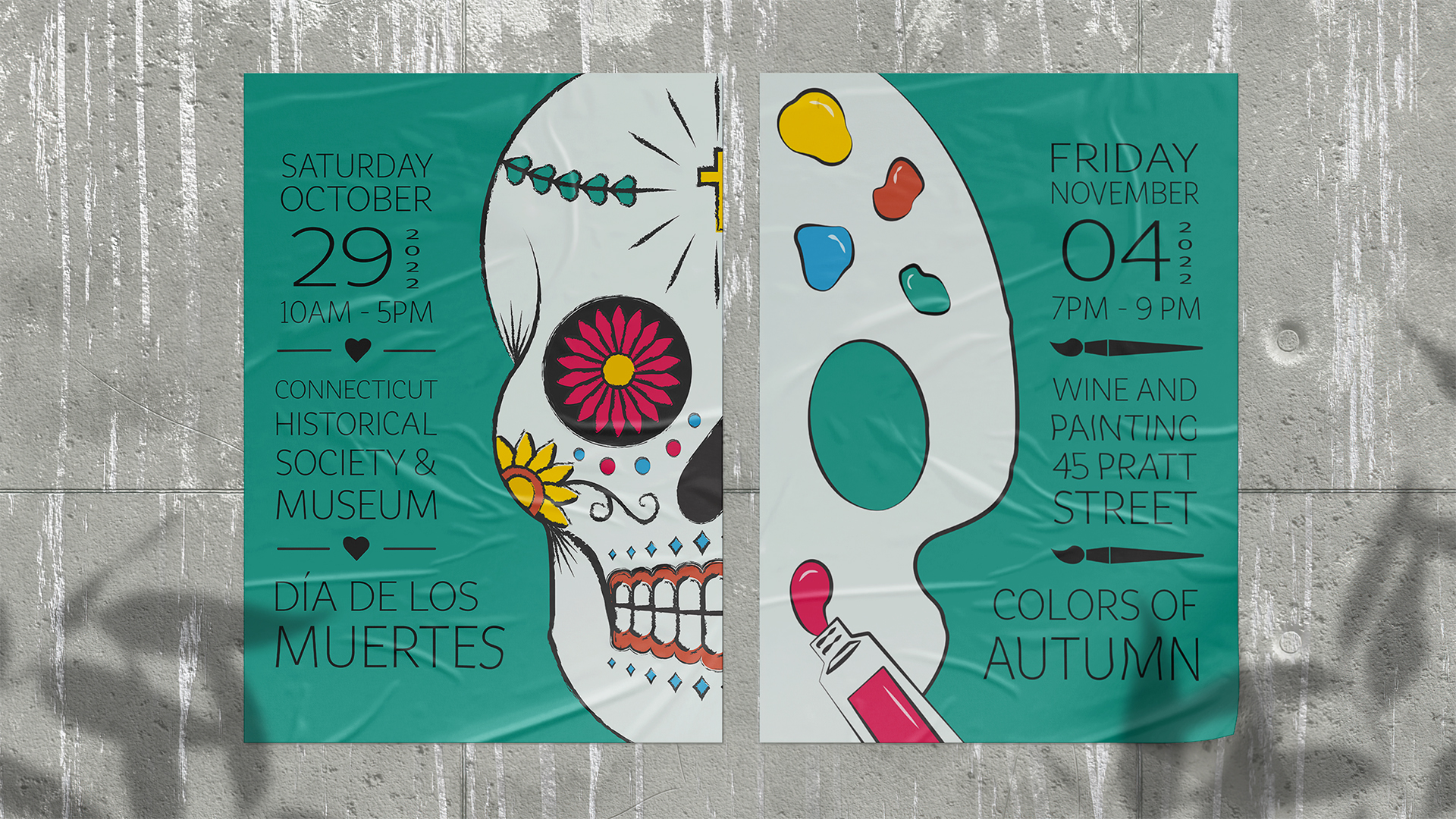
Minimalist Posters
To extend the refreshed brand identity beyond the logo, we designed a cohesive pair of posters to promote Hartford’s seasonal events. The goal was to fill the city’s spaces with a sense of modern pride in a way that feels both welcoming to visitors and authentic to locals. Each design emphasizes clear hierarchy, strong typography, and a similar visual style.
The posters are designed to work together as part of a set, sharing a consistent layout, color palette, and tone. When displayed side by side, the two illustrations almost create one full image. This cohesion not only brings excitement and creativity to its streets but also strengthens recognition of the city’s new brand identity.
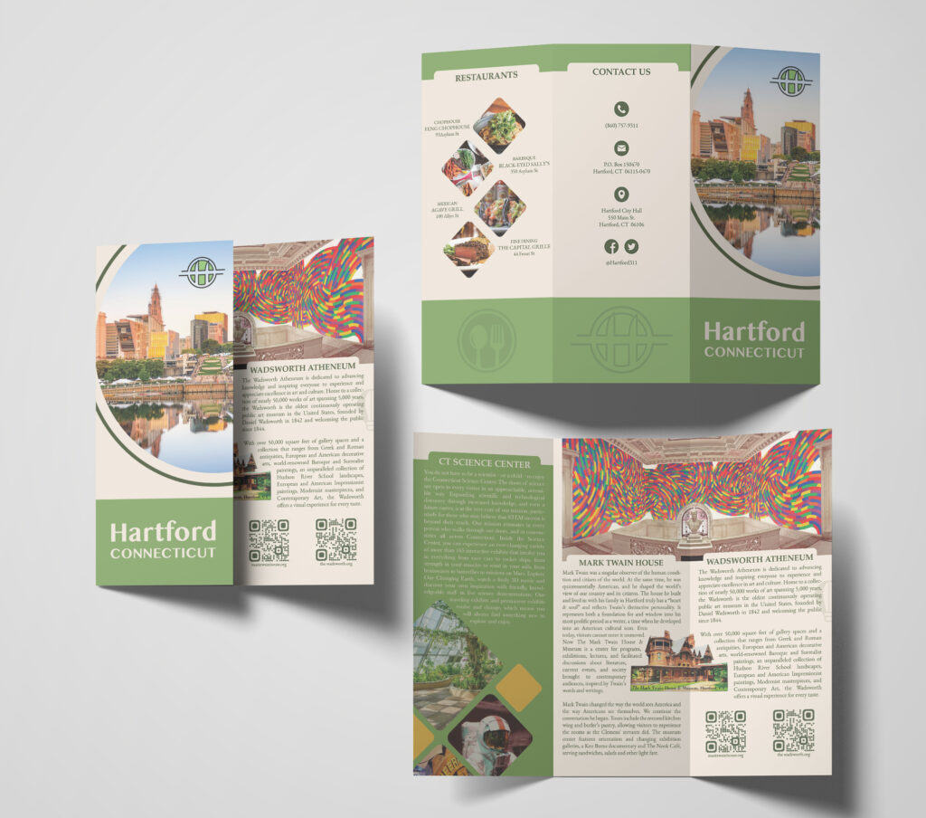
Town Brochure
Committing to the town’s rebrand, we also designed an informational tourist brochure to showcase Hartford’s most beloved landmarks and dining spots. We allowed the refreshed logo’s modern typography and new color palette guide the final design of the brochure. Additionally, we utilized white space, iconography, text wraps, and QR codes to make information easy to navigate for both visitors and residents.
Each interior panel introduces one of the city’s main attractions, including the Connecticut Science Center, Mark Twain House, and Wadsworth Atheneum. The outside sections showcase popular restaurants, contact information, and social media. Ultimately, the brochure serves as both a visual representation and functional guide for the Hartford’s new identity.
Closing
Logo design impacts how people experience a brand, or in this case, a city. An outdated logo can unintentionally suggest stagnation, whereas a refreshed one communicates progress and pride. For Hartford, the goal was to create a visual identity that feels welcoming to visitors and reaffirming for residents. By referencing local transportation, unique attractions, and popular restaurants, we were able to produce grounded designs, rooted in Hartford’s everyday life. Developing a cohesive style across the logo, posters, and brochure emphasized how consistency can bring a city’s personality to the forefront. When each element works together, the result is more than just a new look, it is a renewed sense of identity.