
Assignment
The goal is to develop a rebranding strategy for a local coffee shop to expand its client profile. This rebrand will utilize design principles and a SWOT analysis to enhance the user experience and user interface. The final project includes a redesigned logo, a new value proposition, and mobile application mockups.
Client
White Electric is a local coffee shop based in Providence, Rhode Island (RI). This brand is very unique in that it is one of merely a few dozen worker-owned businesses in the country and the first unionized coffee shop in the state of RI. White Electric maintains strong values surrounding social justice, making this an important aspect of the brand’s identity.
Other characteristics that speak to the brand’s identity include the wall dedicated to showcasing artwork by neighborhood artists and inviting local musicians to play in-house.
Challenges
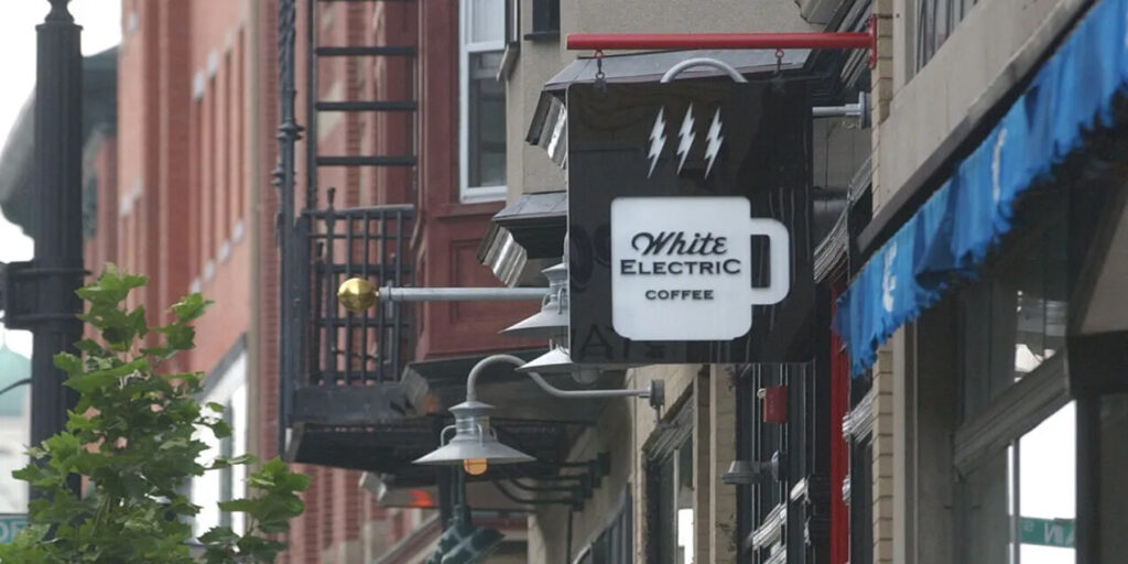
Inconsistent Branding
White Electric has a different logo on its storefront sign, website header, and social media pages. It would be in the brand’s best interest to narrow it down to one logo. After all, a logo is how users recognize a brand and distinguish it from the competition. Consistent branding is important for building trust with the audience.
No Value Proposition
White Electric currently offers no value proposition. This is an issue because they are missing out on a key branding opportunity. A value proposition communicates what a brand offers and why customers should choose them over their competitors. It can be the difference between losing a sale and closing it.
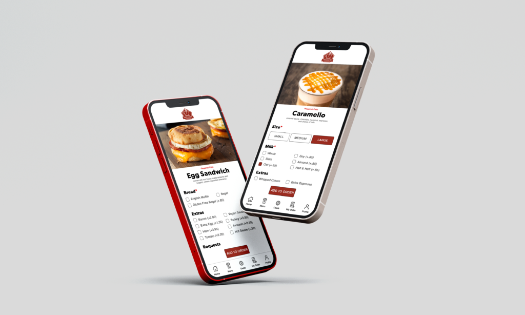
No Mobile Orders
The lack of a mobile application for online orders is a missed opportunity for the brand. Introducing a White Electric mobile app will enhance customer experience, provide rich customer data, increase customer loyalty, and sell more products.
Solutions
Logo Development
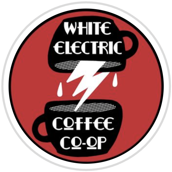
A brand logo is the most important branding element; it is how users identify a brand. As such, it is of the utmost importance that the logo redesign reflects White Electric’s brand identity.
We wanted to combine common elements among the brand’s existing logos for the redesign. White Electric has a unique and edgy vibe that we wanted the new logo to reflect. Using negative space for the lightning bolt gives the logo a unique form that feels representative of the brand identity.
The chosen typography is also important to note. “Electric” has been the guiding concept for this rebrand, so it was necessary that the typography felt electric. Gin Regular accomplishes this perfectly and Mrs. Eaves OT Regular compliments Gin fairly well.
The color palette consists of a warm red and an off-white, both of which are significant to the brand identity. The red possesses brown undertones, which represent coffee without being too obvious and overwhelming. The off-white, on the other hand, is a tribute to the brand name White Electric. It also creates a strong contrast against the red while feeling cohesive given their shared undertones.
The rest of the color palette complements the red and off-white from the logo. This creates a valuable palette to add visual interest for other aspects of branding such as menus, swag, etc.
New Value Proposition

Our proposed value proposition for White Electric is “Spark the flavor. Ignite your day.” This value proposition plays on the brand’s unique and unconventional name for a coffee shop, which further solidifies White Electric’s consumer profile. Furthermore, it promises incomparable coffee and tea flavors as the way for customers to start their day.
Mobile Application
A mobile app creates an immersive, convenient, and instantly recognizable experience for customers, where they can browse the menu at their leisure and save their favorite items.

Closing
If White Electric were to implement this rebrand strategy, the brand could enhance the user experience and broaden its consumer profile.