Neographic Media is a creative studio specializing in brand identity, print design, web development, and digital marketing materials. We curate thoughtful visuals that drive engagement, build trust, and connect brands with their audiences across platforms.
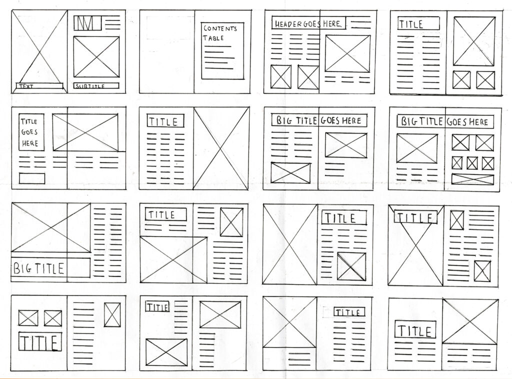
Grids are an essential tool in graphic design, serving as a guide for an organized and balanced layout. In this project, grids provided the position needed to align titles, images, and text across 10 different movie spreads to establish organization. Mastering grid systems is a vital skill for graphic designers, carrying into real-world applications such as print, web, and digital media, where polished designs are a must.
Basic Layout Grids | Patricia Gomez
The Challenge
The goal of this project was to design a booklet entitled Reel Facts: The Book About Movie Trivia. The booklet’s content required selecting ten films spanning five decades (two from each decade: 70s, 80s, 90s, 00s, and 10s). Each spread must feature one film and cover all of the following details:
Movie title and synopsis
Release year and director
Other films by the director
Top three actors
At least five trivia facts
A pull quote from the film
Beyond these criteria, the booklet also required a cohesive cover design, a well-organized table of contents, and the inclusion of high-resolution images.
Source Content

The written content for each film, including synopses, voice actors, quotes, and trivia, was sourced from the IMDb website. Visual content, including hero images and textures, was carefully curated using ShotDeck and Google Images. The ultimate goal was to select imagery that best represented the essence of each film while aligning with the overall theme of the booklet. Incorporating these elements ensured the spreads were both visually engaging and informative.
Thought Process
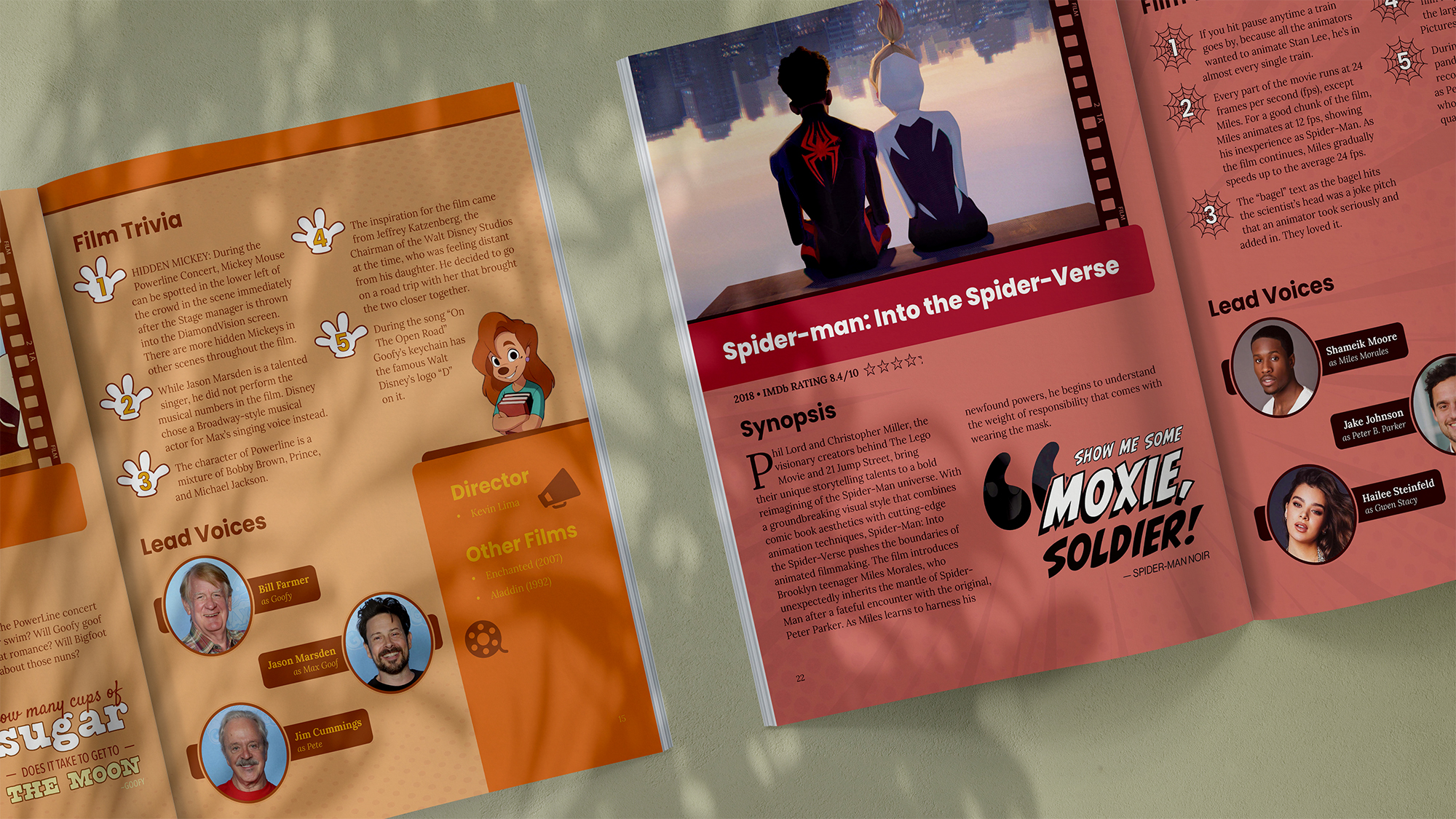
The central focus of this project was to create a unique theme for each spread, paying homage to the corresponding animated film. While this approach produced a visually engaging booklet, it did not come without its own set of challenges. To achieve these design goals, each spread needed to reflect the film’s distinct identity while adhering to a consistent layout.
The layout “formula” developed for this project includes:
Titles and Hero Images: Positioned in the top left of each spread for consistency.
Release Year & Rating: Located directly below the title.
Director Details: Used a shortened “sidebar” to identify the director and list his/her other notable films.
Alternating Layouts: Alternated between the locations of the top three voice actors and five trivia facts.
Pull Quotes: Included a memorable quote paired with a corresponding character.
Textural Elements: Integration of textures that relate to the film’s setting or themes.
This design approach allowed for a variety of layouts, while maintaining flexibility and cohesion across all spreads.
Reel Facts Booklet
The final booklet, Reel Facts: The Book About Movie Trivia, was brought to life using a combination of Adobe programs, each contributing to the polished and professional result.

InDesign: Served as the primary tool for designing the booklet’s layout, ensuring consistent alignment, typography, and spacing across all spreads. The program’s custom grid layouts, color swatches, and paragraph styles features made it easier to organize and adjust dense content.

Photoshop: Techniques like layer masking were employed to remove backgrounds, integrating clean and seamless visuals into the design. These edits enhanced the overall aesthetic by allowing images to interact with the surrounding elements in an more organic way.
Illustrator: The program’s vector capabilities made it ideal for creating crisp and scalable graphics. This made the program ideal for creating engaging typographic pull quotes and ensuring the the cover design felt cohesive with the booklet’s spreads.
Ultimately, each program played a vital role in crafting a cohesive and visually stunning final product, showcasing the power of Adobe’s creative suite for professional design projects.
Reflections
If given the opportunity to revisit this project, I would incorporate additional embellishments to further enhance each spread’s unique thematic elements. Details like paw prints for The Fox & The Hound and bubbles for The Little Mermaid added depth and charm to their respective spreads. Expanding this concept across all spreads could further elevate the overall design.
Like what you see?
Explore our blog page for additional case studies and projects that showcase impressive graphic design.
Students, especially those with a passion for STEM, are strongly encouraged to explore new technologies. Yet, there is resistance from education systems to permit usage of Generative Artificial Intelligence (AI) systems, such as ChatGPT. At the time this article was written, the regulations surrounding AI use in schools could be quite strict, as the repercussions of employing such software can be as severe as expulsion from school.
I would like to note that this exploration of AI technology arises in response to a practical design problem posed within an academic setting. Such an assignment develops the critical skill of grappling with contemporary real-world challenges while devising innovative solutions in preparation for the demands of a rapidly evolving professional landscape. This practical assignment demonstrates not only proficiency in design but also the ability to navigate complex regulatory frameworks and ethical considerations—a valuable skill set in industries like graphic design where emerging technologies play a pivotal role.
Executive Summary
Popular Science Magazine (PopSci) aims to redefine the role of AI systems in education. Misuse of AI technology has largely contributed to the negative narrative surrounding these systems; however, education of how to effectively use AI augmentation to assist with tasks in a productive way can revolutionize human potential.
Neographic Media was tasked with creating a magazine cover, depicting Generative AI as a tool for productivity rather than as a threat to academic growth among students.
Client Goals
Encourage the exploration and education of new technologies
Garner attention for PopSci Magazine
Educate users on proper usage of Generative AI
By achieving these objectives, students will be inspired to embrace the current digital era, ensuring they maintain a competitive edge in the job market through their technological expertise. Ultimately, this initiative will empower individuals to utilize AI effectively, unlocking their full potential while emphasizing responsible and informed usage.
About the Magazine
PopSci stands as a popular U.S. magazine featuring insightful science reporting, cutting-edge technology updates, and engaging DIY projects. With its broad range of topics, PopSci caters not only to general readers but also to science enthusiasts, avid technology users, curious minds, and students seeking inspiration and knowledge.
Popular Science Magazine Logo
In the digital realm, PopSci’s website has drawn 7.1 million visits on both desktop and mobile platforms within the past month alone (as of May 2024). This online presence has secured its standing, currently ranking at #93 in the competitive Programming and Developer software category, according to data from similarweb.com.
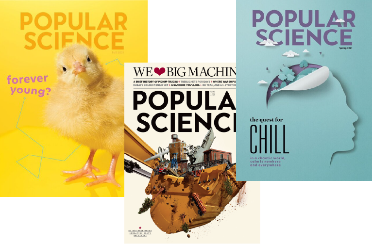
One of PopSci’s defining features is its bold and visually captivating aesthetic, characterized by striking text, vivid imagery, and harmonious color palettes. The magazine’s distinct style captures the essence of its content, making it instantly recognizable and engaging for audiences worldwide.
Emaples of real PopSci Magazine issues sourced from Google Images
Given PopSci’s general content surrounding science and technology, a cover story addressing AI technologies only enhances its reputation for cutting-edge reporting, particularly by showcasing how tools like ChatGPT can revolutionize productivity and empower its readers to optimize their workflows and achieve a better work-life balance.
Design Challenges
The design challenge revolves around conceptualizing a dynamic 3D model for a magazine cover that transforms the perception of ChatGPT as a tool for productivity. This concept will empower students to optimize their workflows, accomplish tasks more efficiently, and reclaim precious time for their passions and relationships.
Design Objectives
Adhere PopSci Magazine standards
Appeal to PopSci’s target audience
Develop a conceptual 3D model
Central to the design process is developing a deeper understanding of the target audience: students. By empathizing with their struggles, aspirations, and preferences, the conceptual model can be tailored to resonate with their needs and aspirations for enhanced productivity and work-life balance.
For this magazine cover design, I will utilize Cinema 4D, a 3D modeling software, to create a realistic model that also serves as a powerful metaphor. This task not only aligns with the magazine company’s mission to deliver compelling and innovative content but also challenges my visual communication skills by demanding the translation of abstract concepts into compelling, impactful imagery.
Process
As iteration is heavily emphasized throughout this post, it is only right to walk through the process it took to reach the final solution.
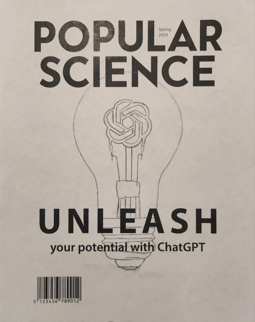
Mid-fidelity Wireframe Concept of PopSci Magazine Cover
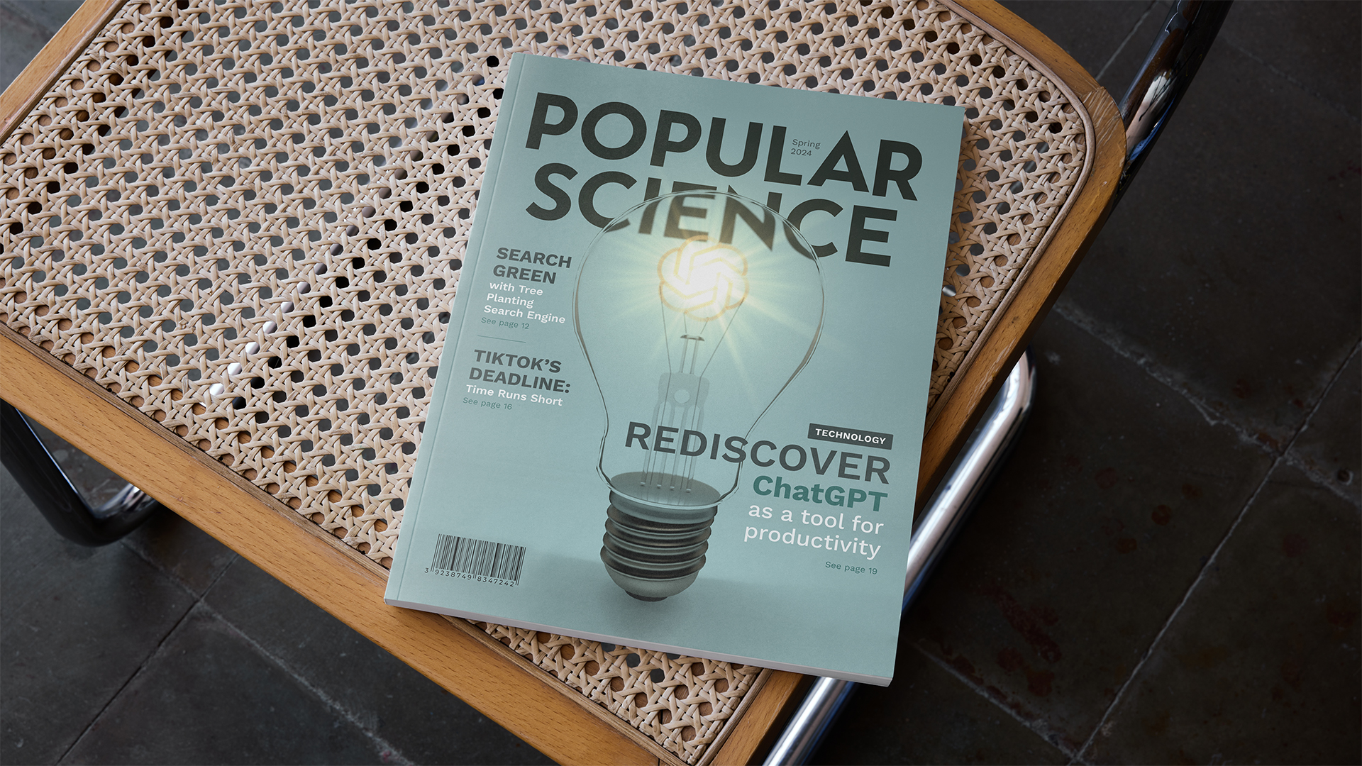
The light bulb serves as a universally recognized symbol of inspiration, innovation, and bright ideas. By replacing the filament within the bulb with the ChatGPT logo, the cover metaphorically communicates the idea that the AI system serves as the driving force behind students’ productivity. Similar to how the filament ignites the light bulb, ChatGPT ignites students’ potential, illuminating their paths to success.
Design Solution
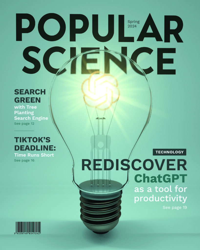
The ultimate solution for PopSci’s cover features a visual metaphor, depicting the ChatGPT logo as the tungsten filament in a light bulb. This concept encapsulates the essence of ChatGPT’s potential to enhance productivity among students.
Redefining Productivity: A 3D Conceptual Cover Design for PopSci Magazine Showcasing ChatGPT as the Filament in a Light Bulb
One of the key enhancements made during the design process was altering the initial concept of the filament. Originally, the filament was depicted as a solid ChatGPT logo. However, I refined this idea by transforming the filament to resemble the delicate, glowing structure of a real light bulb filament, while still maintaining the recognizable shape of the ChatGPT logo. This subtle yet significant change added a layer of realism and visual intrigue, making a world of difference in the overall design.
Breakthroughs
During this process, I experienced the following discoveries:
The value of iteration in design.
Arguably one of the most uncomfortable part of the design process is iteration. This discomfort stems from the acceptance that the initial concept may not have been as strong as the designer originally thought and the fear that the next attempt may not be better. However, seeking trusted feedback and saving all iterations can help counter these emotions and guide the design toward more successful outcomes. Exceptional design is about taking risks.
The importance of visual storytelling in reshaping perceptions.
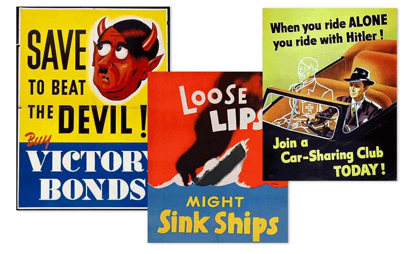
Throughout history, art has been used to shape the perception of the masses. Common examples many may not consider is advertisements (add link to victorian broadside post). Propaganda is a form of advertising with the sole purpose of mass persuasion.
The power to convey a message through imagery alone.
The conceptual aspect of this design communicates a message through merely an image. There text is merely supplementary to the images. As a stand-alone model, the viewers can likely receive the same message.
Conclusions
The process of designing the PopSci magazine cover, with the ChatGPT logo as the filament in a light bulb, was both challenging and enlightening. This project will not only enhance the visual appeal of the magazine but also continue to solidify its reputation as a leader in cutting-edge technology reporting. By reimagining ChatGPT as a tool for productivity, the cover story effectively communicated the transformative potential of AI to a broad audience, including students and tech enthusiasts.
On a personal level, this project served as a prime opportunity for my growth as a designer. It pushed the boundaries of my visual communication skills, requiring a delicate balance between aesthetic appeal and functional clarity. Through advanced 3D modeling techniques and iterative design, I was able to translate abstract concepts into a compelling visual narrative.
Just take a look at the development from concept to creation:
Ultimately, my breakthroughs not only contributed to the success of this project but also provided valuable lessons for future endeavors. These insights will forever stay with me to inform my approach to design challenges, ensuring that I can continue to create impactful and engaging visuals. As I apply these lessons to future projects, I am confident that I will continue to develop as a designer, creating work that is both innovative and meaningful.
Want to see more?
Explore my portfolio for additional case studies and projects that showcase my skills graphic design and visual storytelling.
Today, many towns have logos that have not been updated since the 1900s. This means that many of the logos we see feel outdated. The purpose of this project was to modernize the logo for Connecticut’s state capital, Hartford.
Logo Redesign:
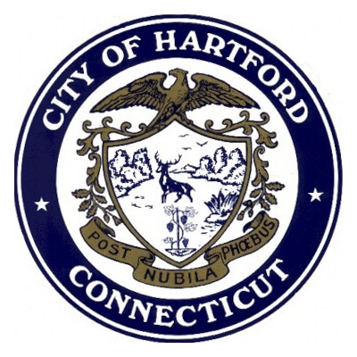
While we can appreciate the level of detail in Hartford’s current logo (pictured below), it has a very old-fashioned and serious feel. We want to modernize the logo to make Hartford give off a friendlier vibe.
Current town logo
Below are our redesigns for the city of Hartford:
Final primary logo redesignFinal secondary logo redesign
The new logo form is friendlier and more modern. The lines breaking out of the outer circle give a feeling of motion and progression. which ties into its color palette that pulls from the transit line CT Fastrak. This green gives a sense of familiarity to locals and unity throughout the city to visitors.
Town Brochure:
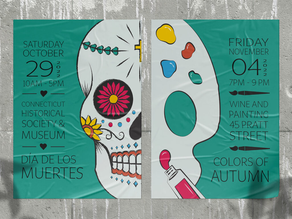
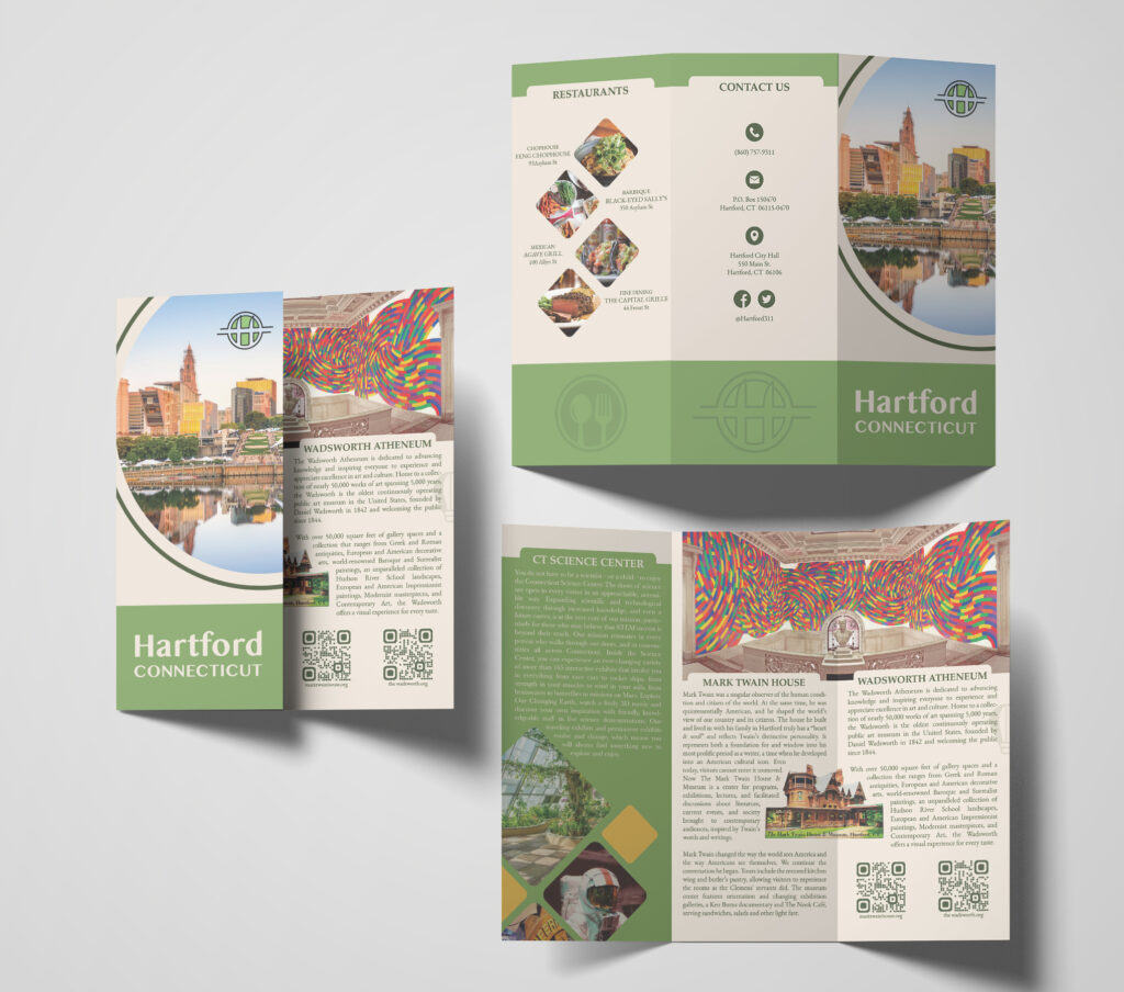
Committing to the town’s rebrand, we took the liberty of designing a tourist brochure utilizing the modern style and color palette of the new logo design.
Hartford tourist brochure with logo redesign
This brochure is complete with Hartford’s main attractions including the Connecticut Science Center, Mark Twain House, and Wadsworth Atheneum as well as the best restaurants. The back panel includes the city’s contact information and social media.
Closing:
Logo design impacts how people perceive a brand, or in this case a town. If your logo is outdated, it may seem that your company is outdated as well. After all, a logo is a reflection of your brand. As such, updating your logo design will reflect positive change and growth.