BRAND LAUNCH! New Energy Drink Refreshers
Assignment
Traditional energy drinks are loaded with artificial ingredients, excessive caffeine, and high sugar. Energy drink refreshers, on the other hand, uses natural ingredients, lower sugar content, and added functional benefits like vitamins or electrolytes. This beverage launch cuts the high amounts of caffeine, sugar, and artificial dyes typically found in energy drinks and delivers energy without the crash.
Project Deliverables
- Brand Identity: Develop a brand name, visual style, and voice
- Can Labels: Create packaging for 2 energy drink refresher flavors
- 4-Pack Packaging: Design a beverage box that conveniently holds four cans
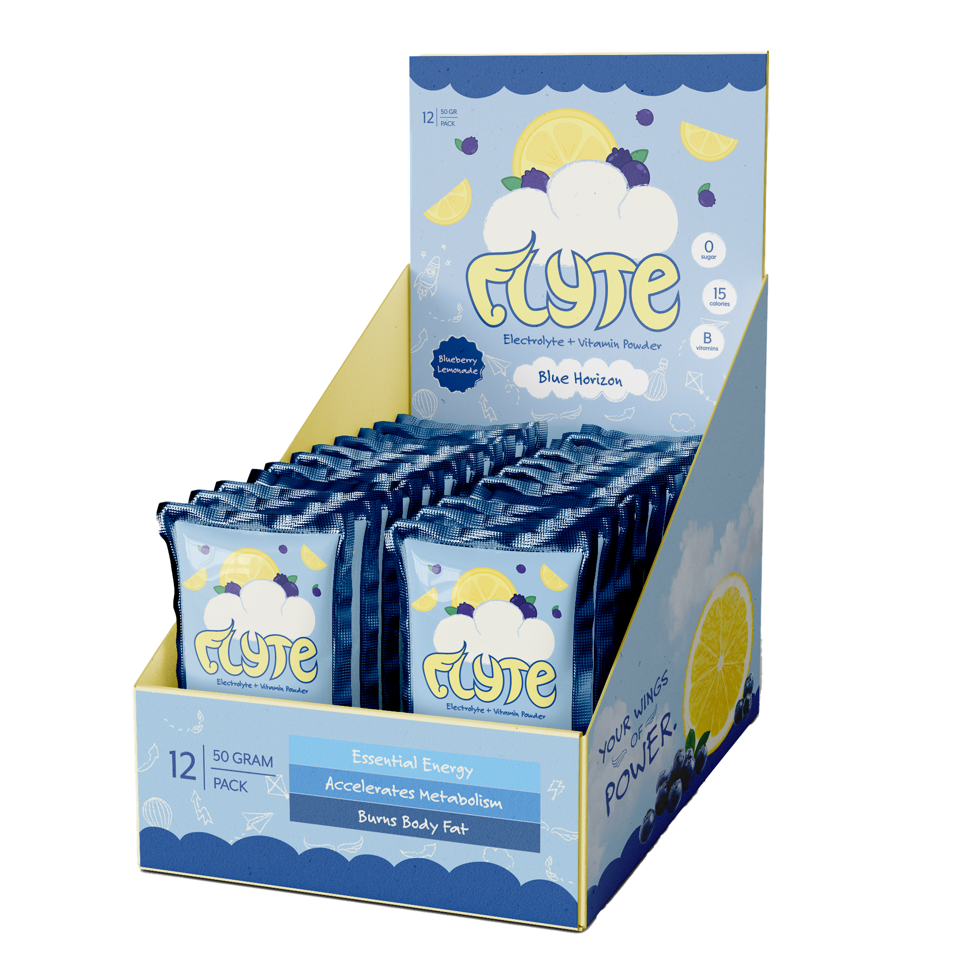
- Brand Extension: Expand the product line to include powder packs
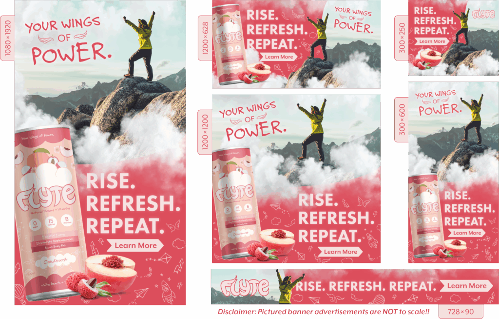
- Web Banners: Attract site traffic using web embeds as advertising
- Social Media Posts: Connect with audience to build product awareness
- Email Marketing: Communicate and engage with potential customers
- Poster: Showcase the product and direct viewers to the website
- Introductory Video: Provide an overview of products and values
- Booklet: Tell brand story and step into its visual style and unique voice
Check
It Out!
The Challenge
With only 9 weeks to develop a brand identity and marketing strategy, the timeline demanded efficient planning and creative problem-solving from start to finish. To build an effective campaign, the team conducted competitor research and a whitespace analysis to identify market gaps and uncover opportunities for differentiation. While energy drink refreshers naturally appeal to health-conscious consumers, younger audiences like Millennials and Gen Z, fitness enthusiasts, and busy students or professionals, this group remains a broad audience. Attempting such a wide target market risks diluting the message and losing engagement, emphasizing the importance of refining the target market to create a campaign that truly resonates.

Our Solution
After conducting thorough research on the existing energy drink market, our team decided to connect with female Gen Z consumers who value both wellness and performance. While most energy drinks on the market use bold, masculine branding and emphasize intensity over balance, this concept focuses on energy with intention. This avenue offers a refreshing alternative that feels approachable, empowering, and aligned with self-care.
Beyond addressing the gender gap, the brand speaks to Gen Z’s growing focus on topics such as sustainability and wellness. From recyclable materials to self-care messaging, the product aims to redefine what an energy drink can represent. This mission guided every stage of the design process, ensuring that the final campaign captured the feeling of upliftment at the center of its mission. That is how Flyte Energy came to be, representing this new product line for energy without the burnout.
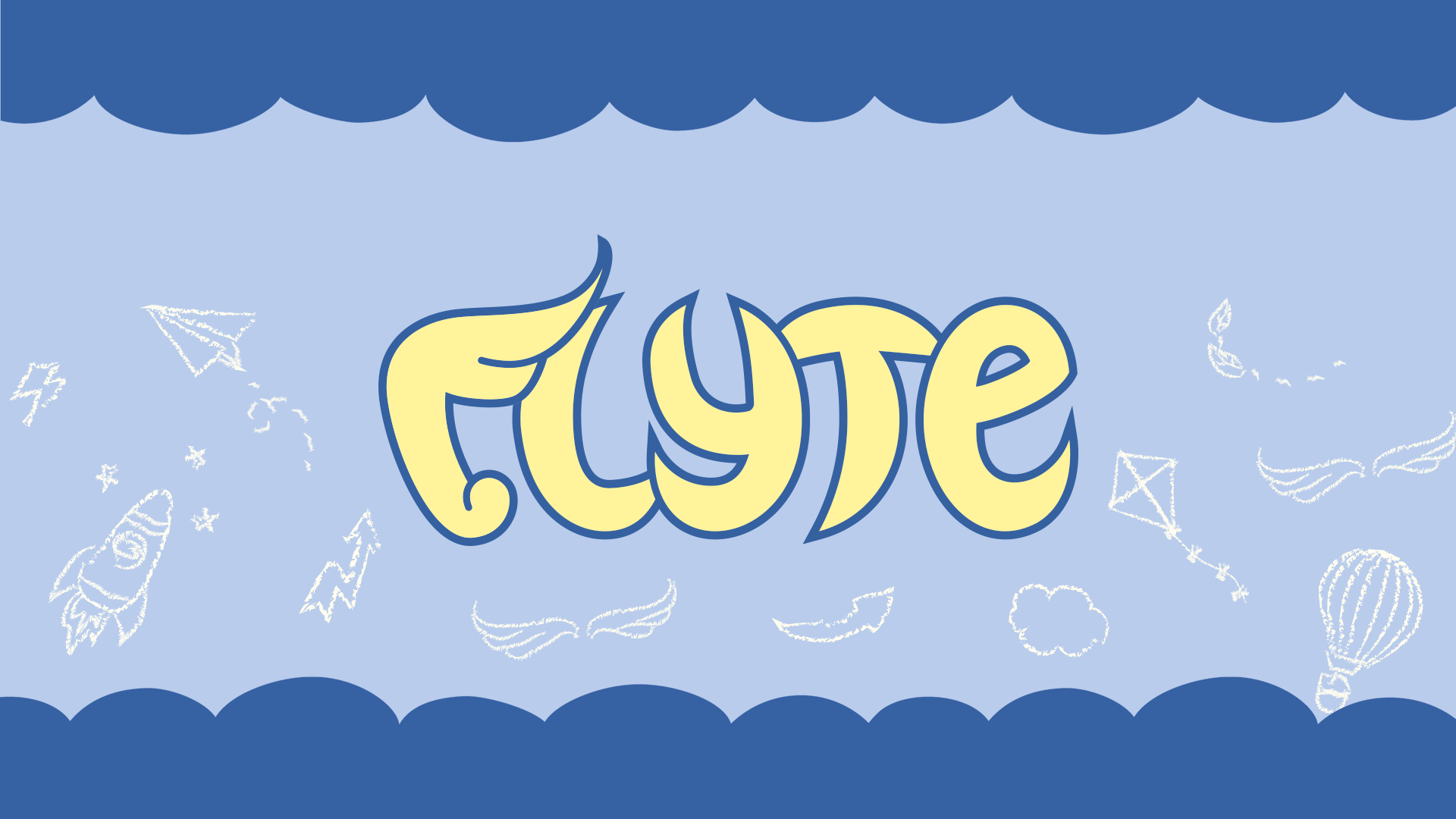
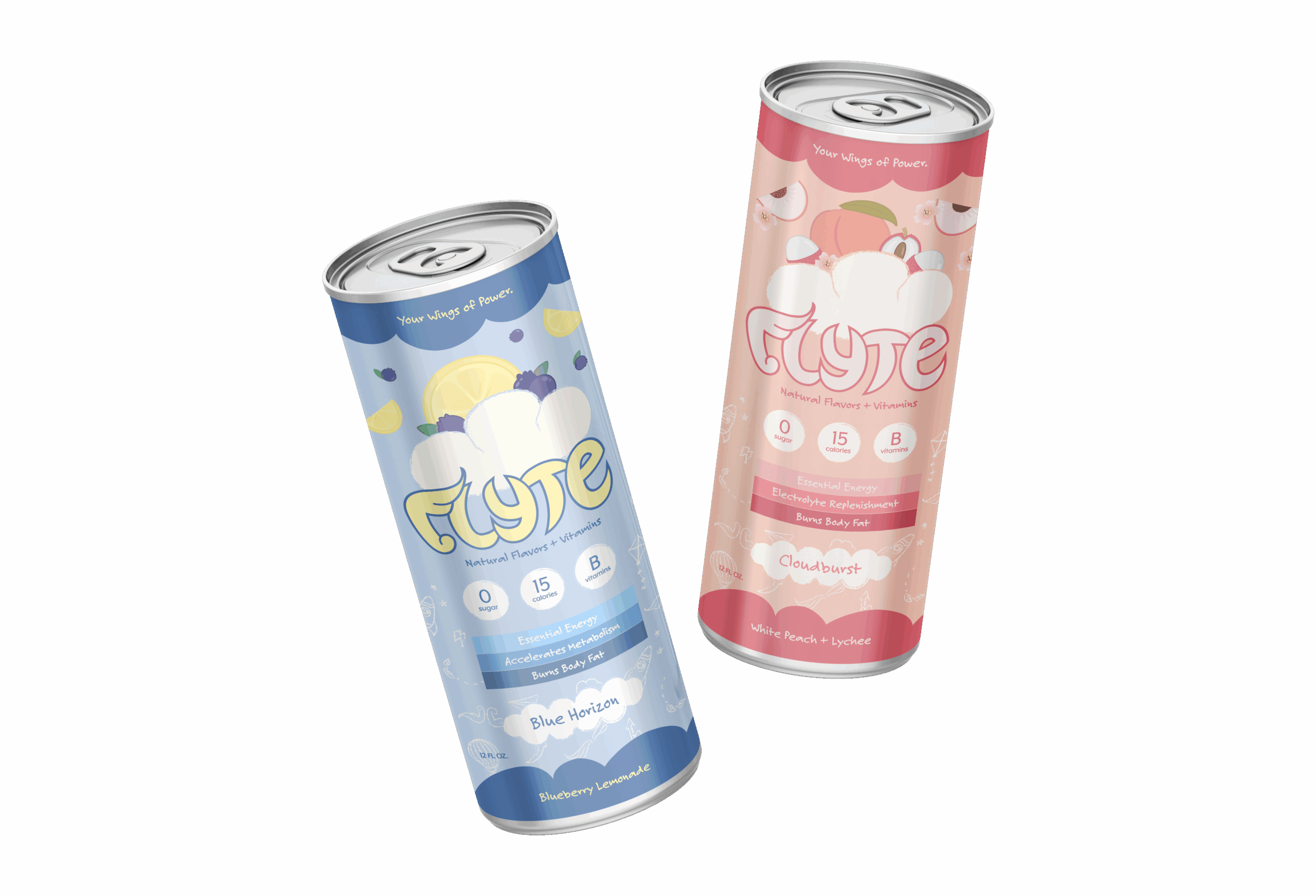
Logo Design
The Flyte logo embodies movement and freedom. Because of this, we created a custom typeface, where the ‘F’ takes on a wing-like form as a symbol of momentum. Paired with our tagline, “Your Wings of Power,” Flyte’s uplifting energy is etched into every detail, giving consumers the confidence to move, create, and take flight.
Flyte’s unique approach to energy ultimately encourages consumers to form a healthy relationship with energy drinks. These energy drink refreshers offer refreshing, clean ingredients without the crash to support focus and reduce burnout.
Packaging Design
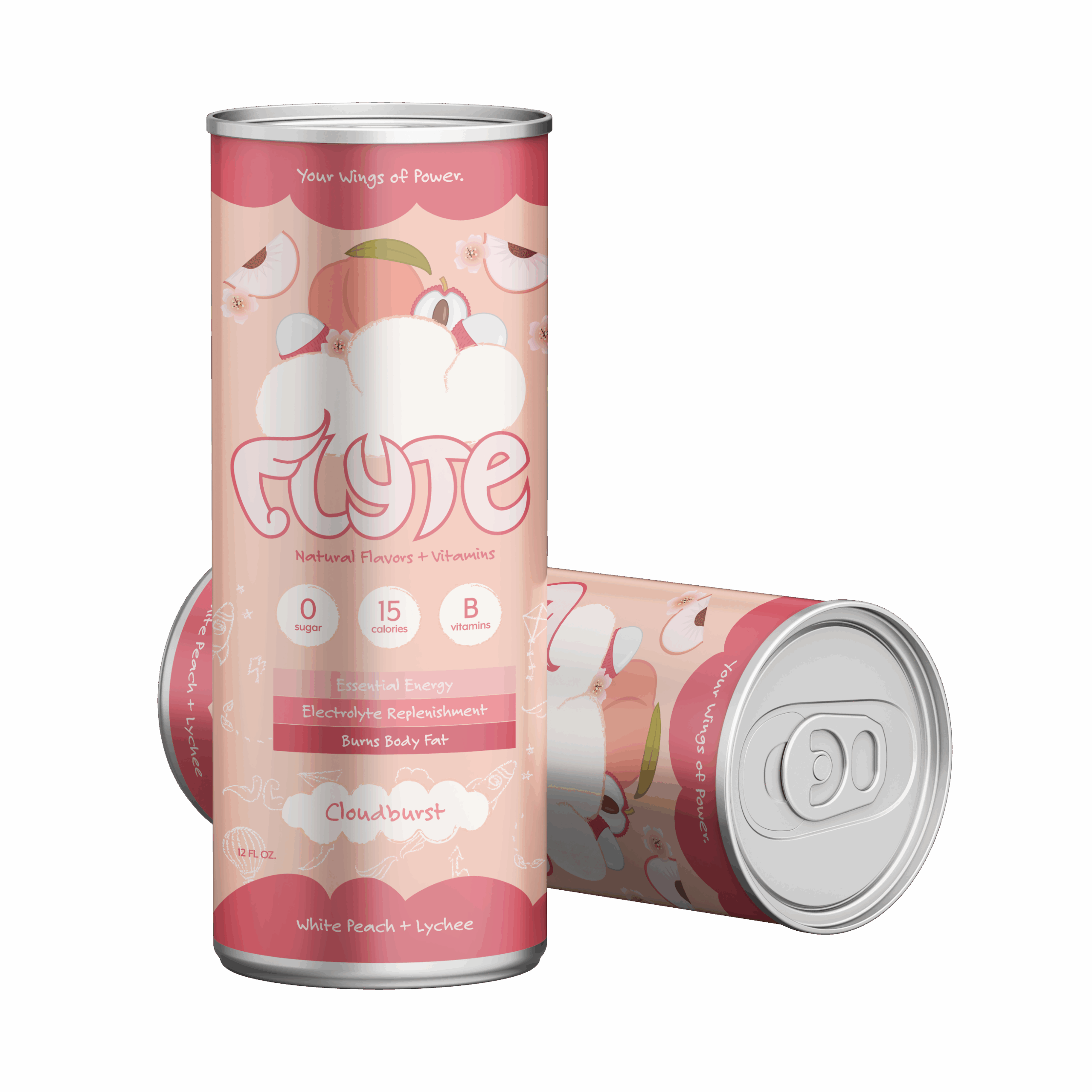
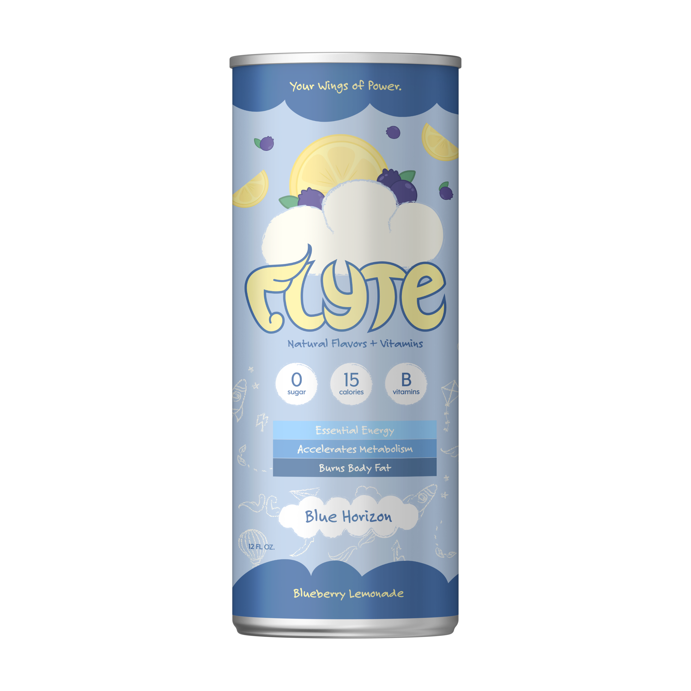
The product line highlights Flyte’s two signature flavors: Blue Horizon and Cloudburst. Each flavor is designed to embody the brand’s balance of wellness and energy. With zero sugar, minimal calories, and essential vitamins, all products support sustained energy without the crash.
Cloudburst: A fruity blend of white peach and lychee inspired a palette of vibrant hues and soft pastels, communicating a sense of lightness and vitality to reflect the drink’s juicy and uplifting flavor.
Blue Horizon: A fresh combination of crisp blueberries and zesty lemon inspires a label that is bright and airy, capturing freshness and exhilaration in every detail.
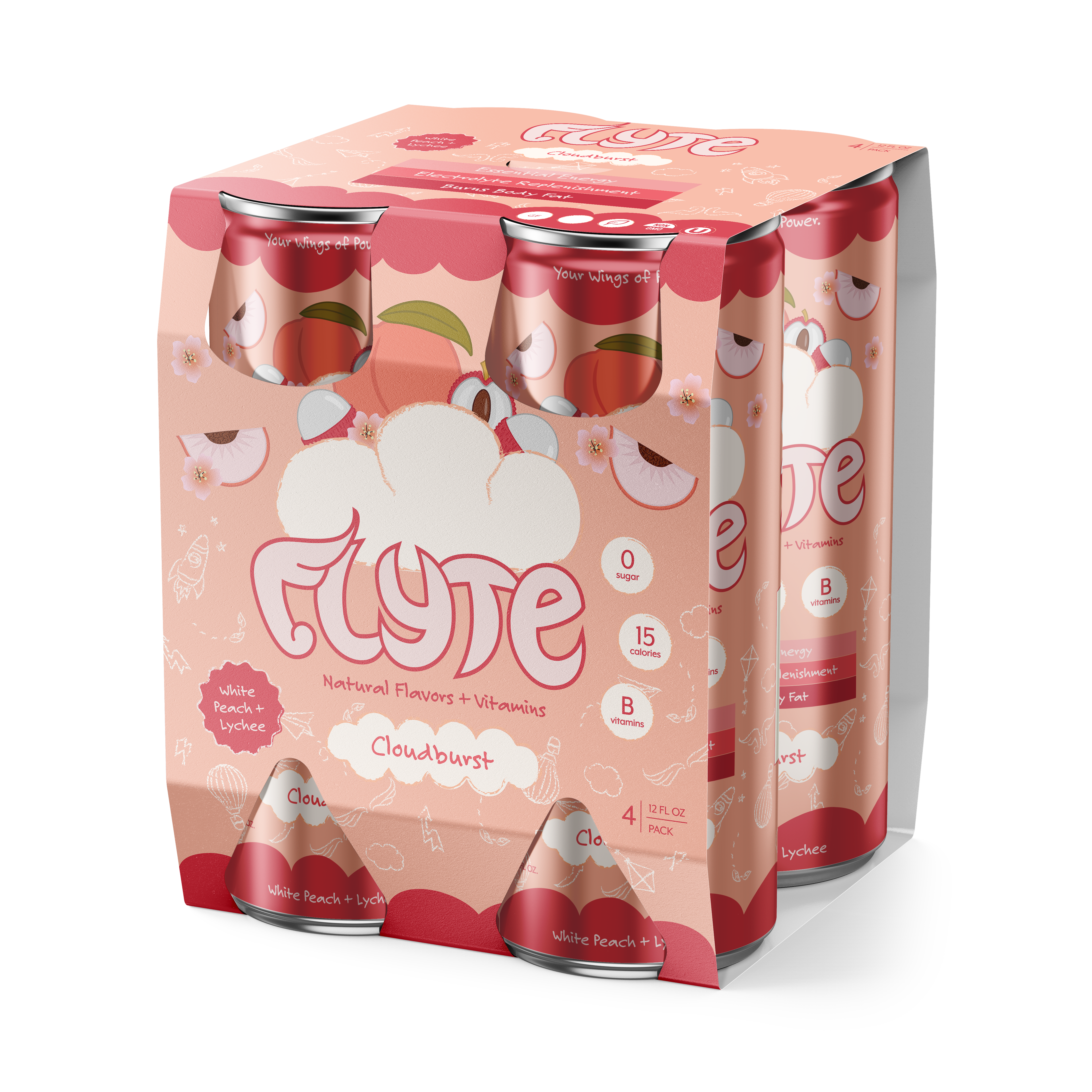
4-Pack: The four-pack carrier equips customers with their favorites, perfect for sharing and convenience while reinforcing brand consistency on shelf displays.
Powder Packs: Compact, portable, and flavor-forward, this brand extension reinforces Flyte’s mission towards wellness in a new product packed with electrolytes and vitamins for daily energy and hydration.
Digital Marketing
The digital campaign builds brand awareness through cohesive storytelling and impactful, motion-driven design. All marketing materials reinforce the brand’s identity and approachable energy across various digital touchpoints.
We set out to design bold, empowering layouts that would immediately capture attention. Using striking imagery and concise, motivating text, these web banners were built for high visibility and seamless adaptability across digital platforms.
The campaign slogan Rise. Refresh. Repeat. embodies Flyte’s message of ambition and balance for young women, encouraging them to rise with confidence, recharge with clean energy, and maintain momentum through mindful habits. The accompanying imagery of a woman standing above the clouds at the mountain’s peak reflects the natural energy and empowerment from Flyte’s products, inspiring viewers to learn more and navigate to the website.
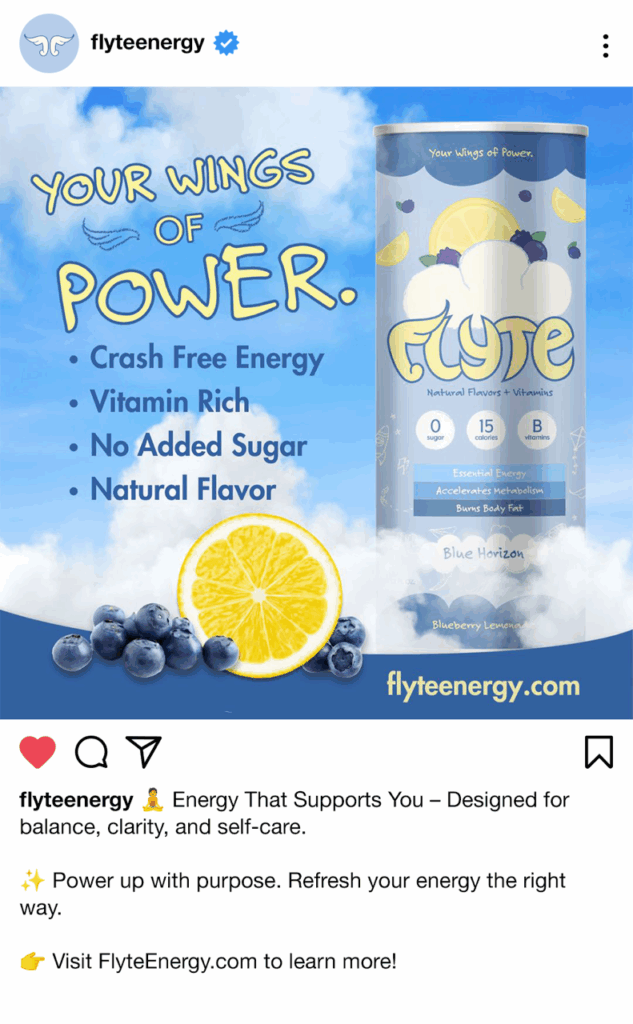
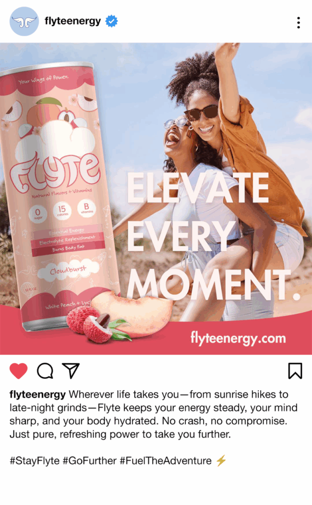
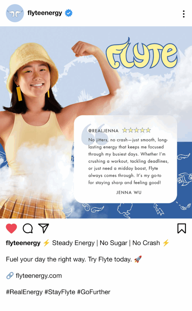
We developed a social media strategy to energize Flyte’s online presence and strengthen community engagement. Each post is designed to increase site traffic and build meaningful audience connections.
Through product introductions, lifestyle imagery, and customer spotlights, Flyte’s social feed embodies confidence and positivity. The visuals and captions work together to celebrate wellness, ambition, and empowerment, encouraging followers to live boldly and stay refreshed.
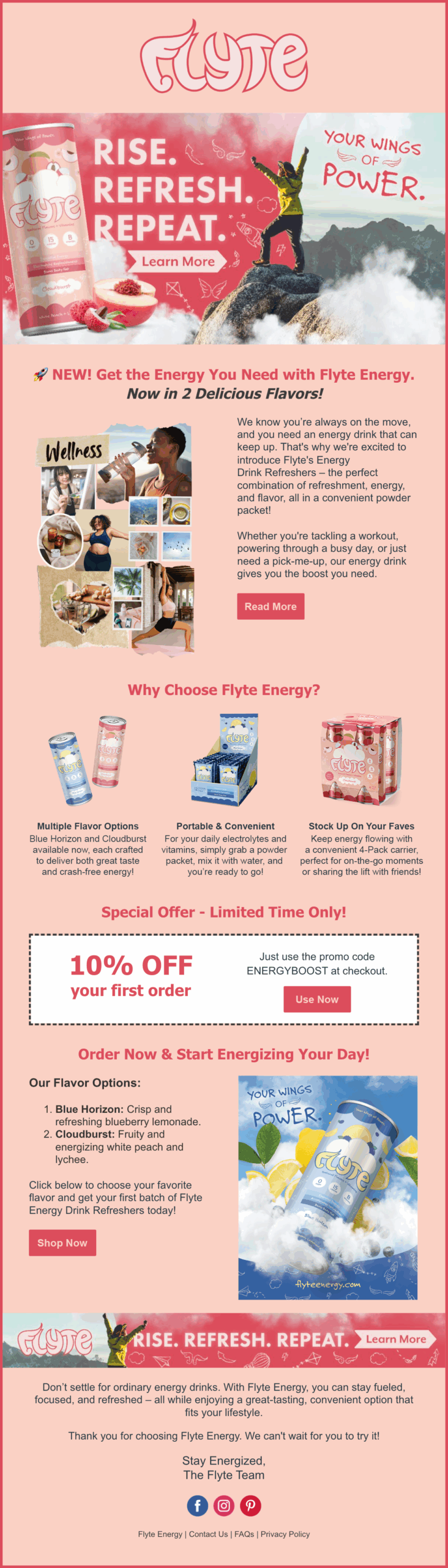
Flyte’s email campaigns were designed to stand out in the inbox while staying true to the brand identity. Each message highlights product launches and special offers in a consistent, digestible format. As the brand evolves, Flyte’s emails will go beyond promotions, featuring wellness tips, community updates, and positive messaging that inspire better energy.
This ongoing communication helps strengthen brand loyalty and deepen audience connections. Each email feels personal yet purposeful, encouraging subscribers to check in, recharge, and stay connected with the Flyte community.
Scroll to
See More
Click for
Full View

Sound On

This project combines poster design and motion graphics into one cohesive video that introduces Flyte’s full product lineup. The opening and closing frames feature a standalone poster design, allowing the piece to loop seamlessly while maintaining a strong visual identity across formats.
The greatest challenge was producing a video for a product that didn’t yet exist. Without access to filmed footage, the solution relied on detailed product mockups, stock assets, and engaging transitions to convey energy and movement. The result is a dynamic video that builds excitement about the launch and encourages viewers to explore the Flyte website.
Final Reflection
This project strengthened our approach to branding by showing how storytelling and problem-solving work hand in hand to create meaningful design solutions. The design process revolved around identifying strategies to appeal to the target market, ensuring that imagery and messaging aligned with audience expectations. We are especially proud of the produced marketing materials, particularly the banner ads. Although the ads were the most challenging aspect of this project, they were the most rewarding. Maintaining brand consistency and audience impact across the six formats truly refined our ability to think strategically and design with purpose.
Working within a tight 9-week timeline also pushed us to manage time efficiently, apply feedback effectively, and stay focused under pressure. This project also brought together skills across several design programs: Photoshop, Illustrator, InDesign, After Effects, Canva, and Constant Contact. Applying these tools to real-world branding and marketing challenges was both exciting and affirming, showcasing versatility and growth as a designer ready to take on new creative challenges.